The Workspace
Layout
Section titled “Layout”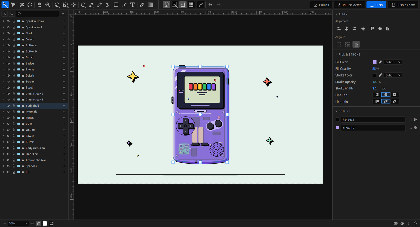
| Area | Where | Holds |
|---|---|---|
| Toolbar | Top | Tools, the active tool’s options, Path actions, undo and redo, Pull and Push |
| Layers | Left column | The pulled layers and everything inside them. See Layers |
| Canvas | Center | Your artwork |
| Properties | Right column | Settings for the active tool and the selection |
| Status bar | Bottom | Zoom, transparency grid, background color, Outline view, isolation breadcrumbs, the selection and messages, then Keyboard Shortcuts, Preferences, the menu and What’s New |
Drag a column’s edge to resize it, or hide it with its toggle. The Design Mode Layers and Design Mode Properties panels show the same columns as panels you can dock anywhere.
Toolbar
Section titled “Toolbar”
From left to right: the tools, the active tool’s options, Path actions, undo and redo, then Pull all, Pull selected, Push and Push as new.
- Hover a tool to see its name and shortcut.
- A tool with a small corner triangle holds more tools. Click the triangle, or hold the button and release over the tool you want. The button keeps the last tool you used.
- Double-click a tool button for a shortcut action: Rotate resets rotation to 0, Scale resets scale to 100%, Anchor Tool centers the anchor point, and a shape tool creates a comp-sized shape.
Tools at a glance
Section titled “Tools at a glance”


Tools that share a button sit in its flyout: Layer, Group and Path Selection; Rotate and Reflect; Scale and Shear; the shape tools and Line; Pen and the three vertex tools.
Tool options sit right of the tools:
| Option | Does |
|---|---|
| Snapping (magnet) | Turns snapping and smart guides on or off. Hold Ctrl to flip it during a drag |
| Transform Mode | Combined, Individual: Comp or Individual: Object. See Transforming |
| Show Transform Box | Shows or hides the selection’s transform box |
| Transform anchor | Which point of the box transforms pivot around |
| Offset Path options | Only with the Offset Path tool. Its default Join and Miter limit |
Floating toolbar
Section titled “Floating toolbar”Right-click the toolbar and choose Undock toolbar to float the tools over the canvas. Drag the grip to move it; double-click the grip to send it back to the top-left corner. Right-click it to choose Horizontal or Vertical, or Dock toolbar to put it back. Only the tools float; options, Pull and Push stay in the top bar.
Narrow panels
Section titled “Narrow panels”When the top bar does not fit the panel, it gives way in this order:
- Pull all, Pull selected, Push and Push as new lose their labels.
- Each pair folds into one button. A click runs Pull all or Push. Hold the button, or click its corner triangle, to reach the other.
- Path actions, then the tool options, then the tools move into the More tools (») button.
The first tool button, undo and redo, and Pull and Push always stay on the bar.
Moving around the canvas
Section titled “Moving around the canvas”| Action | How |
|---|---|
| Pan | Hold Space and drag, drag with the middle mouse button, or use the Hand tool (H) |
| Zoom | Mouse wheel (with Mouse wheel set to Pan, hold Ctrl or Alt), . and ,, or the Zoom tool (Z): click to zoom in, Alt-click to zoom out, drag left or right to scrub |
| Fit the comp | Ctrl+0 |
| Fit, no larger than 100% | Ctrl+Shift+0 |
| 100%, centered | / |
| Frame the selection | F |
The status bar’s Magnification menu offers the same fits plus fixed zoom levels.
Rulers and guides
Section titled “Rulers and guides”- Ctrl+R shows or hides the rulers.
- Drag out of a ruler to make a guide. Drag it back to the ruler, or select it and press Delete, to remove it.
- Guides snap while you drag them, and Push writes them to the comp.
Background and Outline view
Section titled “Background and Outline view”
The status bar’s checkerboard button toggles the transparency grid. Background Color chooses Comp Color or a Custom color. Neither changes your comp.
Outline view (Ctrl+Y), beside them, draws every shape as a thin outline.
Preferences
Section titled “Preferences”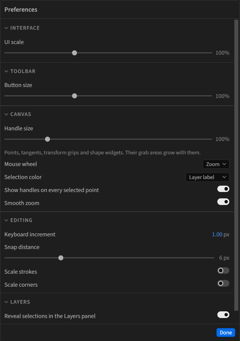
The gear in the status bar opens Preferences. Click a section title to collapse or expand it.
| Section | Option | Does |
|---|---|---|
| Interface | UI scale | The size of the panel’s controls and text, 75 to 150% |
| Toolbar | Button size | The size of the tool buttons relative to UI scale, 75 to 150% |
| Canvas | Handle size | The size of points, tangents, transform grips and shape widgets, and their grab areas, 75 to 200% |
| Mouse wheel | Zoom (default) or Pan. With Pan, the wheel scrolls up and down, Shift scrolls sideways, and Ctrl or Alt zooms | |
| Selection color | Layer label (default) draws selections in each layer’s label color. Custom color uses the swatch beside it | |
| Show handles on every selected point | On by default. Off, tangent handles show only while one point is selected | |
| Smooth zoom | On by default. Zoom steps, fits, F, / and Zoom tool clicks ease to the new view. Off, they jump | |
| Editing | Keyboard increment | How far an arrow key moves the selection, 0.01 to 100 px, 1 px by default. Shift moves ten times as far |
| Snap distance | How close the pointer must come before it snaps, 1 to 20 px, 6 by default | |
| Scale strokes | Off by default. On, stroke widths scale with the artwork | |
| Scale corners | Off by default. On, corner roundness scales with the artwork | |
| Layers | Reveal selections in the Layers panel | Selecting on the canvas opens the layer and groups above it in the Layers list |
Scale strokes and Scale corners also sit in the Scale tool’s Scale section in Properties. Double-click a slider to reset it. Done closes the sheet.
Menu and What’s New
Section titled “Menu and What’s New”
Right of the gear, the menu button holds User guide, License, Submit feedback and About, and the bell opens What’s New. See Installation for licensing.