Collections and Folders
Collections
Section titled “Collections”A collection is a set of buttons arranged in folders — one for motion graphics, one for cleanup, one per client. Switch between them from the collection menu at the top of the panel, where you can also create, rename, and delete collections.
Every button you make lives in your library, whatever collection it was made in — and one button can live in several collections at once. + > Add from library puts an existing button into the current collection without duplicating it, and editing it anywhere edits it everywhere.
To take a button out of a collection without deleting it, right-click it and choose Remove from [collection] — it stays in your library and in every other collection that holds it. Delete is the permanent one, and it says so before it acts.
Reorder collections in the same menu opens a sheet where every collection is a row you drag into the order you want. The order applies everywhere the collection menu appears.
Folders
Section titled “Folders”Folders hold buttons and other folders — they nest as deep as you like. Click a folder to expand or collapse it.
Right-click a folder to add a button to it, add a sub-folder, or rename, duplicate, and delete it. Folders can carry their own colors and icon defaults, which their buttons inherit.
Adding buttons by dropping files
Section titled “Adding buttons by dropping files”Drop files straight onto the panel — onto a folder, or the space below the list — and they become buttons: .jsx and .js files make script buttons, .ffx files make preset buttons, several at once if you like. (One image dropped on an existing button becomes its icon instead.)
Rearranging
Section titled “Rearranging”Click the pencil to enter edit mode, then drag buttons and folders where you want them. Renaming happens on the row itself — Enter keeps it, Escape backs out.
List and grid views
Section titled “List and grid views”The view switch in the footer flips between the list and an icon grid — a compact board of tiles, best with custom icons. The slider next to it sizes buttons in both views.
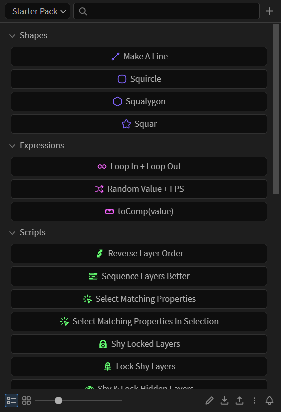
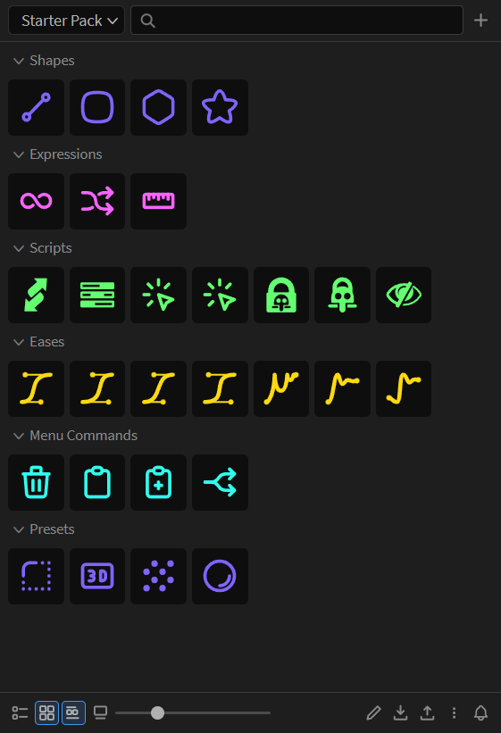
In grid view, three extra footer controls appear: one shows or hides the group headings, one the tile labels, and Columns fixes the grid at 1 to 6 columns instead of Auto, which fits as many as the panel is wide. At a fixed count the size slider sets the tile’s height and the columns share the width.
In list view, buttons are centered with their icon on the left. Both can be changed under Menu > Settings > Collection > List buttons.
Each collection keeps its own layout
Section titled “Each collection keeps its own layout”View, button size, grid labels, grid groups and column count are remembered per collection, so one collection can be a one-column grid of icons while another stays a list. Turn it off under Menu > Settings > Preferences and one setting covers them all.
Either way, layout stays on this computer. It is not part of a collection you share.
Buttons only
Section titled “Buttons only”Right-click anywhere and choose Buttons only to hide the panel’s toolbar and footer, leaving nothing but your buttons — it works in both list and grid view. The way back is the same right-click: the menu is available on every button and folder, so you are never stranded.
Searching
Section titled “Searching”The search box filters the current collection as you type, and folders holding a match open on their own.